|
Applications often use Toolbars to provide shortcuts to commonly-used menu items, such as File|Open or File|Save. They contain
a row of buttons, usually with an icon. Each toolbar item can have an icon, a label, and a tooltip. You will often be able to reuse standard gtkmm stock items such as Gtk::Stock::SAVE.
Elements are inserted by using classes from the Gtk::Toolbar_Helpers namespace. The various helper objects are:
Here's the constructor for Element:
Element(Widget& w,
        const Glib::ustring& tooltip_text=0,
        const Glib::ustring& tooltip_private_text=0);
w is the widget to insert, and tooltip_text is the text for the element's tooltip. You can ignore tooltip_private_text. The constructors for ButtonElem and ToggleElem are exactly alike; each has three forms. Here are the ButtonElem constructors:
// text + icon
ButtonElem(const Glib::ustring& text,
           Widget        & content,
           SigC::Slot0<void>        callback,
           const Glib::ustring& tooltip_text=0,
           const Glib::ustring& tooltip_private_text=0);

// icon only
ButtonElem(Widget        & content,
           SigC::Slot0<void>        callback,
           const Glib::ustring& tooltip_text=0,
           const Glib::ustring& tooltip_private_text=0);

// text only
ButtonElem(const Glib::ustring& text,
           SigC::Slot0<void>        callback,
           const Glib::ustring& tooltip_text=0,
           const Glib::ustring& tooltip_private_text=0);
The only difference between these is whether they take an icon, text, or both as arguments. text is the text to display below the icon. content is the icon; note that any widget can be inserted here, but generally this will be a pixmap or other display widget. callback is the signal handler to use for the button. tooltip_text will be displayed in the button's tooltip, and you can safely ignore tooltip_private_text. The RadioElem constructors are the same as those for ButtonElem and RadioElem, but they take an additional argument specifying the group for the radio button. Here they are:
// text + icon
RadioElem(Gtk::RadioButton_Helpers::Group& group,
          const Glib::ustring&      text,
          Widget&             content,
          SigC::Slot0<void>   callback=0,
          const Glib::ustring&      tooltip_text=0,
          const Glib::ustring&      tooltip_private_text=0);

// icon only
RadioElem(Gtk::RadioButton_Helpers::Group& group,
          Widget&             content,
          SigC::Slot0<void>   callback=0,
          const Glib::ustring&      tooltip_text=0,
          const Glib::ustring&      tooltip_private_text=0);

// text only
RadioElem(Gtk::RadioButton_Helpers::Group& group,
          const Glib::ustring&      text,
          SigC::Slot0<void>   callback=0,
          const Glib::ustring&      tooltip_text=0,
          const Glib::ustring&      tooltip_private_text=0);
The group argument is the only addition here; it works exactly like the group argument for normal radio buttons. See the Radio Buttons section for details. The toolbar's contents are manipulated through an STL-like list, which you can obtain using the tools() method:
ToolList& tools(); For example, to add a text-only button tool to the toolbar, we could write
toolbar.tools().push_back(Gtk::Toolbar_Helpers::ButtonElem(
        "Crash",slot(&crash_cb),"Causes the program to dump core");
Since it's inconvenient to have to type Gtk::Toolbar_Helpers all the time, you might want to add a using declaration. However, don't add a global using namespace Gtk::Toolbar_Helpers declaration; place this only in some localised scope, to avoid clashes with other Helpers namespaces. File: examplewindow.h
#ifndef GTKMM_EXAMPLEWINDOW_H
#define GTKMM_EXAMPLEWINDOW_H

#include <gtkmm.h>

class ExampleWindow : public Gtk::Window
{
public:
  ExampleWindow();
  virtual ~ExampleWindow();

protected:
  //Signal handlers:
  virtual void on_button_close();
  virtual void on_toolbar_item();

  //Child widgets:
  Gtk::VBox m_VBox;
  Gtk::HButtonBox m_ButtonBox;
  Gtk::Toolbar m_Toolbar;
  Gtk::Button m_Button_Close;
};

#endif //GTKMM_EXAMPLEWINDOW_H
File: examplewindow.cc
#include "examplewindow.h"
#include <iostream>
ExampleWindow::ExampleWindow()
: m_Button_Close("Close")
{
set_title("Gtk::Toolbar example");
add(m_VBox);
//Put a toolbar at the top, and a button underneath:
m_VBox.pack_start(m_Toolbar, Gtk::PACK_SHRINK);
m_ButtonBox.set_border_width(5);
m_ButtonBox.set_layout(Gtk::BUTTONBOX_END);
m_VBox.pack_end(m_ButtonBox);
m_ButtonBox.pack_start(m_Button_Close, Gtk::PACK_SHRINK);
m_Button_Close.signal_clicked().connect( SigC::slot(*this, &ExampleWindow::on_button_close) );
//Add the toolbar items:
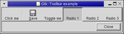
{
using namespace Gtk::Toolbar_Helpers;
m_Toolbar.tools().push_back( ButtonElem("Click me", SigC::slot(*this, &ExampleWindow::on_toolbar_item), "Toolbar item") );
m_Toolbar.tools().push_back( Space() );
m_Toolbar.tools().push_back( StockElem(Gtk::Stock::SAVE, SigC::slot(*this, &ExampleWindow::on_toolbar_item)) );
m_Toolbar.tools().push_back( ToggleElem("Toggle me", SigC::slot(*this, &ExampleWindow::on_toolbar_item), "toggle duh") );
Gtk::RadioButton::Group group;
m_Toolbar.tools().push_back( RadioElem(group, "Radio 1") );
m_Toolbar.tools().push_back( RadioElem(group, "Radio 2") );
m_Toolbar.tools().push_back( RadioElem(group, "Radio 3") );
}
show_all_children();
}
ExampleWindow::~ExampleWindow()
{
}
void ExampleWindow::on_button_close()
{
hide();
}
void ExampleWindow::on_toolbar_item()
{
std::cout << "Toolbar item clicked." << std::endl;
}
File: main.cc
#include <gtkmm/main.h>
#include "examplewindow.h"

int main(int argc, char *argv[])
{
  Gtk::Main kit(argc, argv);

  ExampleWindow window;
  Gtk::Main::run(window); //Shows the window and returns when it is closed.

  return 0;
}
|