
CHAPTER 3 - THE PANEL ITEMS
3.1 INTRODUCTION
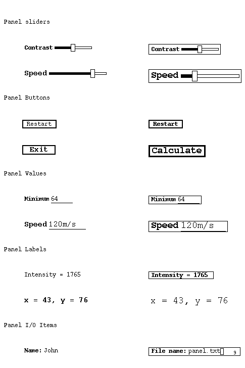
Some of the view-objects already described make use of some standard panel items. Those currently available are described in the sections which follow.Figure 3.1 Examples of panel choice items
Figure 3.2 Examples of other panel items
List of sections:
The Panel Choice Item
The Panel Slider Item
The Panel Button Item
The Panel Value Item
The Panel Label ITem
The Panel I/O Item
Control Item View-Objects
3.2 THE PANEL CHOICE ITEM
This is a panel item which provides a drop down menu for selecting an option. Examples are shown in Fig. 3.1. The item has a title in bold print at the left hand end, an indicator box with a downward pointing arrow to show that it has a drop down menu, and a display of the currently selected option at the right hand side. The item may optionally be enclosed in a rectangular box and a range of different font sizes may be used. When pointing to an item in the drop down menu, that item will be shown in bold print.
An option is selected from the drop down menu of the panel choice item as follows:
- Either:
- Point to the panel choice item (e.g. to the indicator box)
- Hold down Button3 of the mouse
- Move the pointer to the required option on the drop down menu
- Release Button3 of the mouse to select the option
(If Button3 is released with the pointer off the menu then the option selection will be abandoned and the drop down menu will disappear)
- Or:
- Point to the panel choice item (e.g. to the indicator box)
- Click Button3 of the mouse
- Move the pointer to the required option on the drop down menu
- Click Button1 or Button3 of the mouse to select the option
(If Button1 or Button3 of the mouse is clicked with the pointer off the menu then the option selection will be abandoned and the drop down menu will disappear)
The default option may also be selected by pointing to the panel choice item and clicking Button1 of the mouse.
3.3 THE PANEL SLIDER ITEM
A panel slider item enables the setting of a value between two extreme limits by moving a grip box along a bar. The item has a title in bold print at the left hand side and the slider bar with grip box at the right hand side. The item may optionally be enclosed in a rectangular box and a range of different font sizes may be used. Examples are shown in Fig. 3.2. The resolution of the values which may be returned to the program depends on the range of values covered and the length of the slider bar. The mimimum change in position of the grip box is one pixel. The panel slider is thus most useful for values which require only an approximate setting as for example the slider used to control the contrast of an image in the image view object.
The grip box on the slider is moved as follows:
- Point to the grip box
- Hold down Button1 of the mouse and move the mouse to the left or right till the grip box is in the required position
- Release Button1 of the mouse
3.4 THE PANEL BUTTON ITEM
The panel button item is used to input a command to the program. It is the equivalent of a single item menu. The item consists of a rectangular box (normally with a thick border) with a text string inside it in either normal or bold print. The text will normally indicate the operation that will be performed if the button is 'pressed'. A range of different font sizes may be used.
A panel button is 'pressed' as follows:
- Point to the panel button item (the button will be highlighted)
- Click Button1 of the mouse
When the pointer points at a panel button item then, on a colour display, the background will be highlighted in cyan. Also, if the text is not already in bold print, then it will be changed to bold print.
3.5 THE PANEL VALUE ITEM
The panel value item is used to display a parameter value which may be changed by the user when required. The item consists of a parameter name at the left hand side in bold print and a parameter value with a line under it at the right hand side. The length of the line under the value indicates the maximum length allowed for the value string. The item may optionally be enclosed in a rectangular box and a range of different font sizes may be used.
The value of a panel value item may be changed as follows:
- Point to the panel value item (the value will be highlighted)
- Click Button1 of the mouse (the old value will be cleared and a text cursor will appear)
- Type in the new value from the keyboard (the characters may be deleted from the end if needed by pressing the Delete or Backspace key). Alternatively a value string selected on another window may be pasted in by pressing Button2 when the value input is awaited.
- Press the Return key to input the new value.
When the parameter value is highlighted on a colour display, the background surrounding it will be coloured cyan. On any display, the panel value string will be changed to bold print.
To abandon the input of a new value, press the Escape key on the keyboard; the old value will be replaced.
The panel value item must have the keyboard focus when a new value is being typed in. It automatically gains the keyboard focus when Button1 of the mouse is clicked with the pointer pointing at the panel value item. If, however, the keyboard focus is changed while a value is being input, then the value input will be abandoned and the old value will be replaced.
The panel value item returns a text string to the program. Any syntax checking and subsequent actions taken depend on the program. The program may reset the value if necessary.
3.6 THE PANEL LABEL ITEM
The panel label item is merely a text string which may be changed by the program if required. It may be in normal or bold print in a range of font sizes and may, optionally, be surrounded by a rectangular box.
3.7 THE PANEL I/O ITEM
The panel i/o item is used to display a prompt and read in a reply text string. It may be re-used as often as needed and may be cleared by the program when required. The reply area will scroll left and right if required to enable a reply, which is longer than the length of the displayed reply area (up to a maximum length as set by the program for that reply) to be input. The reply area has a text cursor displayed. The user may delete characters to the left of the cursor by pressing the 'Delete' or 'Backspace' keys. Characters typed in will be added at the current cursor position allowing insertion of text if the cursor is not at the end of the reply. The cursor may be moved to left or right using the left and right arrow keys. The input is completed by pressing the 'Return' or 'Enter' or 'Linefeed' key. When the input has been completed, the cursor will be removed. Input may be abandoned by pressing the 'Escape' key. When input is awaited and the window has the keyboard focus, the cursor will be like an underscore with small vertical lines at each end; if the keyboard focus is lost the cursor will change to an open rectangle in which case the keyboard focus may be regained by clicking the mouse Button1 with the cursor in the panel i/o window. There is an option to display an input reply character count at the right hand end of the item. A value string selected on another window may be pasted in by pressing Button2 when the value input is awaited.
3.8 CONTROL ITEM VIEW-OBJECTS
Each of the panel items may also be used by the program as a control item view-object. The panel item may appear on its own or, where appropriate, with an active strip.

John W. Campbell
CCLRC Daresbury Laboratory
Last update 4 Feb 1998