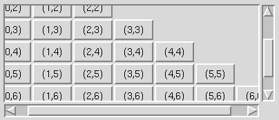

Pmw.ScrolledFrame() - frame with optional scrollbars
A scrolled frame consists of a scrollable interior frame within a clipping frame. The programmer can create other widgets within the interior frame. If the frame becomes larger than the surrounding clipping frame, the user can position the frame using the horizontal and vertical scrollbars.
The scrollbars can be dynamic, which means that a scrollbar will only be displayed if it is necessary. That is, if the frame is smaller than the surrounding clipping frame, the scrollbar will be hidden.
If 'fixed', the interior frame is set to the natural width, as requested by the child widgets of the frame. If 'expand' and the requested width of the interior frame is less than the width of the clipping frame, the interior frame expands to fill the clipping frame. If 'shrink' and the requested width of the interior frame is more than the width of the clipping frame, the interior frame shrinks to the width of the clipping frame. If 'elastic', the width of the interior frame is always set to the width of the clipping frame. The default is 'fixed'.
If None, a label component is not created. The default is None.
Otherwise, the size of the megawidget is determined by the width and height of the clipper component, along with the size and/or existence of the other components, such as the label, the scrollbars and the scrollmargin option. All these affect the overall size of the megawidget. The default is 0.
If 'fixed', the interior frame is set to the natural height, as requested by the child widgets of the frame. If 'expand' and the requested height of the interior frame is less than the height of the clipping frame, the interior frame expands to fill the clipping frame. If 'shrink' and the requested height of the interior frame is more than the height of the clipping frame, the interior frame shrinks to the height of the clipping frame. If 'elastic', the height of the interior frame is always set to the height of the clipping frame. The default is 'fixed'.
place to position widgets: if a widget (in this case the
frame component) is placed inside a frame (in this case the
clipper component) and it extends across one of the edges of the
frame, then the widget obscures the border of the frame.
Therefore, if the clipper has no border, then this overlapping
does not occur. By default, this component is a Tkinter.Frame.
component('frame').
Usually, this method does not need to be called explicitly, since the position of the frame component and the scrollbars are automatically updated whenever the size of the frame or clipper components change or the user clicks in the scrollbars. However, if horizflex or vertflex is 'expand', the megawidget cannot detect when the requested size of the frame increases to greater than the size of the clipper. Therefore, this method should be called when a new widget is added to the frame (or a widget is increased in size) after the initial megawidget construction.
If mode == 'moveto', adjust the view of the interior so that the fraction value of the total width of the contents is off-screen to the left. The value must be between 0.0 and 1.0.
If mode == 'scroll', adjust the view of the interior left or right by a fixed amount. If what is 'units', move the view in units of horizfraction. If what is pages, move the view in units of the width of the scrolled frame. If value is positive, move to the right, otherwise move to the left.
If mode == 'moveto', adjust the view of the interior so that the fraction value of the total height of the contents is off-screen to the top. The value must be between 0.0 and 1.0.
If mode == 'scroll', adjust the view of the interior up or down by a fixed amount. If what is 'units', move the view in units of vertfraction. If what is pages, move the view in units of the height of the scrolled frame. If value is positive, move to down, otherwise move up.
class Demo:
    def __init__(self, parent):
        # Create the ScrolledFrame.
        self.sf = Pmw.ScrolledFrame(parent,
                labelpos = 'n', label_text = 'ScrolledFrame',
                usehullsize = 1,
                hull_width = 400,
                hull_height = 220,
        )

        # Create a group widget to contain the flex options.
        w = Pmw.Group(parent, tag_text='Flex')
        w.pack(side = 'bottom', padx = 5, pady = 3)

        hflex = Pmw.OptionMenu(w.interior(),
                labelpos = 'w',
                label_text = 'Horizontal:',
                items = ['fixed', 'expand', 'shrink', 'elastic'],
                command = self.sethflex,
                menubutton_width = 8,
        )
        hflex.pack(side = 'left', padx = 5, pady = 3)
        hflex.invoke('fixed')

        vflex = Pmw.OptionMenu(w.interior(),
                labelpos = 'w',
                label_text = 'Vertical:',
                items = ['fixed', 'expand', 'shrink', 'elastic'],
                command = self.setvflex,
                menubutton_width = 8,
        )
        vflex.pack(side = 'left', padx = 5, pady = 3)
        vflex.invoke('fixed')

        # Create a group widget to contain the scrollmode options.
        w = Pmw.Group(parent, tag_text='Scroll mode')
        w.pack(side = 'bottom', padx = 5, pady = 0)

        hmode = Pmw.OptionMenu(w.interior(),
                labelpos = 'w',
                label_text = 'Horizontal:',
                items = ['none', 'static', 'dynamic'],
                command = self.sethscrollmode,
                menubutton_width = 8,
        )
        hmode.pack(side = 'left', padx = 5, pady = 3)
        hmode.invoke('dynamic')

        vmode = Pmw.OptionMenu(w.interior(),
                labelpos = 'w',
                label_text = 'Vertical:',
                items = ['none', 'static', 'dynamic'],
                command = self.setvscrollmode,
                menubutton_width = 8,
        )
        vmode.pack(side = 'left', padx = 5, pady = 3)
        vmode.invoke('dynamic')

        self.radio = Pmw.RadioSelect(parent, selectmode = 'multiple',
            command = self.radioSelected)
        self.radio.add('center', text = 'Keep centered vertically')
        self.radio.pack(side = 'bottom')

        buttonBox = Pmw.ButtonBox(parent)
        buttonBox.pack(side = 'bottom')
        buttonBox.add('add', text = 'Add a button', command = self.addButton)
        buttonBox.add('yview', text = 'Show yview', command = self.showYView)
        buttonBox.add('scroll', text = 'Page down', command = self.pageDown)

        # Pack this last so that the buttons do not get shrunk when
        # the window is resized.
        self.sf.pack(padx = 5, pady = 3, fill = 'both', expand = 1)

        self.frame = self.sf.interior()

        self.row = 0
        self.col = 0

        for count in range(15):
            self.addButton()

    def sethscrollmode(self, tag):
        self.sf.configure(hscrollmode = tag)

    def setvscrollmode(self, tag):
        self.sf.configure(vscrollmode = tag)

    def sethflex(self, tag):
        self.sf.configure(horizflex = tag)

    def setvflex(self, tag):
        self.sf.configure(vertflex = tag)

    def addButton(self):
        button = Tkinter.Button(self.frame,
            text = '(%d,%d)' % (self.col, self.row))
        button.grid(row = self.row, column = self.col, sticky = 'nsew')

        self.frame.grid_rowconfigure(self.row, weight = 1)
        self.frame.grid_columnconfigure(self.col, weight = 1)
        if self.sf.cget('horizflex') == 'expand' or \
                self.sf.cget('vertflex') == 'expand':
            self.sf.reposition()

        if 'center' in self.radio.getcurselection():
            self.sf.update_idletasks()
            self.centerPage()

        if self.col == self.row:
            self.col = 0
            self.row = self.row + 1
        else:
            self.col = self.col + 1

    def showYView(self):
        print self.sf.yview()

    def pageDown(self):
        self.sf.yview('scroll', 1, 'page')

    def radioSelected(self, name, state):
        if state:
            self.centerPage()

    def centerPage(self):
        # Example of how to use the yview() method of Pmw.ScrolledFrame.
        top, bottom = self.sf.yview()
        size = bottom - top
        middle = 0.5 - size / 2
        self.sf.yview('moveto', middle)
![]()
Pmw 1.3 -
6 Aug 2007
- Home
Manual page last reviewed: 18 February 2001