Pmw.ComboBox

Name

Pmw.ComboBox() - dropdown or simple combination box

Inherits

Pmw.MegaWidget

Description

A combobox contains an entry field and an associated scrolled listbox. When an item in the listbox is selected, it is displayed in the entry field. Optionally, the user may also edit the entry field directly.

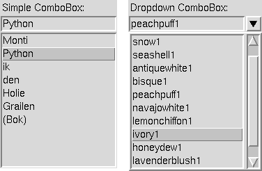
For a simple combobox, the scrolled listbox is displayed beneath the entry field. For a dropdown combobox (the default), the scrolled listbox is displayed in a window which pops up beneath the entry field when the user clicks on an arrow button on the right of the entry field. Either style allows an optional label.

Options

Options for this megawidget and its base classes are described below.

autoclear
Initialisation option. If both autoclear and history are true, clear the entry field whenever <Return> is pressed, after adding the value to the history list. The default is 0.

buttonaspect
Initialisation option. The width of the arrow button as a proportion of the height. The height of the arrow button is set to the height of the entry widget. The default is 1.0.

dropdown
Initialisation option. Specifies whether the combobox should be dropdown or simple. The default is 1.

fliparrow
Initialisation option. If true, the arrow button is draw upside down when the listbox is being displayed. Used only in dropdown megawidgets. The default is 0.

history
Initialisation option. When <Return> is pressed in the entry field, the current value of the entry field is appended to the listbox if history is true. The default is 1.

labelmargin
Initialisation option. If the labelpos option is not None, this specifies the distance between the label component and the rest of the megawidget. The default is 0.

labelpos
Initialisation option. Specifies where to place the label component. If not None, it should be a concatenation of one or two of the letters 'n', 's', 'e' and 'w'. The first letter specifies on which side of the megawidget to place the label. If a second letter is specified, it indicates where on that side to place the label. For example, if labelpos is 'w', the label is placed in the center of the left hand side; if it is 'wn', the label is placed at the top of the left hand side; if it is 'ws', the label is placed at the bottom of the left hand side.

If None, a label component is not created. The default is None.

listheight
Initialisation option. The height, in pixels, of the dropdown listbox. The default is 200.

selectioncommand
The function to call when an item is selected. If this function takes a long time to run, and you want the entry field to be updated quickly, call update_idletasks() at the beginning of the function. Alternatively, wrap the function using Pmw.busycallback(). The default is None.

sticky
Initialisation option. The default is 'ew'.

unique
Initialisation option. If both unique and history are true, the current value of the entry field is not added to the listbox if it is already in the list. The default is 1.

Components

Components created by this megawidget and its base classes are described below.

arrowbutton
In a dropdown combobox, the button to popup the listbox. By default, this component is a Tkinter.Canvas.

entryfield
The entry field where the current selection is displayed. By default, this component is a Pmw.EntryField.

hull
This acts as the body for the entire megawidget. Other components are created as children of the hull to further specialise this class. By default, this component is a Tkinter.Frame.

label
If the labelpos option is not None, this component is created as a text label for the megawidget. See the labelpos option for details. Note that to set, for example, the text option of the label, you need to use the label_text component option. By default, this component is a Tkinter.Label.

popup
In a dropdown combobox, the dropdown window. By default, this component is a Tkinter.Toplevel.

scrolledlist
The scrolled listbox which displays the items to select. By default, this component is a Pmw.ScrolledListBox.

Component aliases

Sub-components of components of this megawidget may be accessed via the following aliases.

entry
Alias for entryfield_entry.
listbox
Alias for scrolledlist_listbox.

Methods

Only methods specific to this megawidget are described below. For a description of its inherited methods, see the manual for its base class Pmw.MegaWidget. In addition, methods from the following classes are forwarded by this megawidget. Methods from Pmw.ScrolledListBox are forwarded to the scrolledlist component. Methods from Pmw.EntryField are forwarded to the entryfield component. Forwarded methods are searched in the order given.

bbox(index)
This method is explicitly forwarded to the scrolledlist component's bbox() method. Without this explicit forwarding, the bbox() method (aliased to grid_bbox()) of the hull would be invoked, which is probably not what the programmer intended.

clear()
Delete all items from the scrolled listbox and delete all text from the entry widget.

get(first = None, last = None)
This is the same as the get() method of the scrolledlist component, except that if first is None then the value of the entry field is returned.

invoke()
If a dropdown combobox, display the dropdown listbox. In a simple combobox, select the currently selected item in the listbox, call the selectioncommand and return the result.

selectitem(index, setentry = 1)
Select the item in the listbox specified by index which may be either one of the items in the listbox or the integer index of one of the items in the listbox.

If setentry is true, also set the entry field to the selected item.

size()
This method is explicitly forwarded to the scrolledlist component's size() method. Without this explicit forwarding, the size() method (aliased to grid_size()) of the hull would be invoked, which is probably not what the programmer intended.

Example

The image at the top of this manual is a snapshot of the window (or part of the window) produced by the following code.

class Demo:
    def __init__(self, parent):
        parent.configure(background = 'white')

        # Create and pack the widget to be configured.
        self.target = Tkinter.Label(parent,
                relief = 'sunken',
                padx = 20,
                pady = 20,
        )
        self.target.pack(fill = 'x', padx = 8, pady = 8)

        # Create and pack the simple ComboBox.
        words = ('Monti', 'Python', 'ik', 'den', 'Holie', 'Grailen', '(Bok)')
        simple = Pmw.ComboBox(parent,
                label_text = 'Simple ComboBox:',
                labelpos = 'nw',
                selectioncommand = self.changeText,
                scrolledlist_items = words,
                dropdown = 0,
        )
        simple.pack(side = 'left', fill = 'both',
                expand = 1, padx = 8, pady = 8)

        # Display the first text.
        first = words[0]
        simple.selectitem(first)
        self.changeText(first)

        # Create and pack the dropdown ComboBox.
        colours = ('cornsilk1', 'snow1', 'seashell1', 'antiquewhite1',
                'bisque1', 'peachpuff1', 'navajowhite1', 'lemonchiffon1',
                'ivory1', 'honeydew1', 'lavenderblush1', 'mistyrose1')
        dropdown = Pmw.ComboBox(parent,
                label_text = 'Dropdown ComboBox:',
                labelpos = 'nw',
                selectioncommand = self.changeColour,
                scrolledlist_items = colours,
        )
        dropdown.pack(side = 'left', anchor = 'n',
                fill = 'x', expand = 1, padx = 8, pady = 8)

        # Display the first colour.
        first = colours[0]
        dropdown.selectitem(first)
        self.changeColour(first)

    def changeColour(self, colour):
        print 'Colour: ' + colour
        self.target.configure(background = colour)

    def changeText(self, text):
        print 'Text: ' + text
        self.target.configure(text = text)

Pmw 1.3 - 6 Aug 2007 - Home
Manual page last reviewed: 1 November 1998